Posts

Lyrical Poster

Image
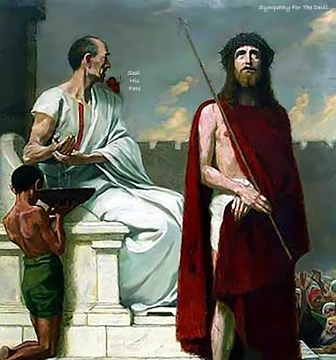
                I choose "Sympathy For The Devil" by The Rolling Stones for my lyrical poster, but it was not my first song that came to mind. " Politician" by Cream I thought first, but it was limited in its lyrical content. So, I set on Sympathy because it's a lyrical epic: going through thousands of years, with a driving narrative. The song covers the terrible acts of history from Jesus' betrayal, to the Nazis, and modern events of police brutality. It is a comment on how we blame bad actions on a supernatural force. My first illustration was the Temple Mount in Jerusalem- because of the verse on Jesus- with a sculpt of JFK- verse on the Kennedy Assassinations- I imposed on the wall, along with a little Devil in the corner. The issue with this was the devil is an illustration, so it would be hard to make it look good with a photographic background. So, I decided on using a biblical illustration which would fit better with the dev...
Am I In St. Topez?

Image
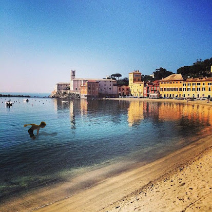
Self- insertion onto a beach in St. Topez, France. I made sure to  have a suncrest over my body, my reflection in the water, and to  fade where my body touches the water.

Miss M

Image
  This is a illustration of Marilyn Monroe. I used an Alfred Eisenstaedt photograph of Monroe at her home, 1953.  In this illustration, I balanced between heavy detail, and cartoon generalizations. This art piece took hours, but it is my favorite.  

Kitty Tramp

Image
  The Exquiste Corspe. This started out as three seperate drawings, by three different people. I was one of them, drawing the pants. The color choice, and details of the fur, were uniquly mine. I named this  character: “Kitty Tramp.”

Just Like A Woman Graphic

Image
  Music is a natural fit for a caligramme. “Just Like A Woman” by Bob Dylan came to mind, along with the famous poster of Dylan by Milton Glaser. Using lyrics for hair came naturally, and its dissjointed look gives the impression of unkept hair.

Production Co. Logo

Image
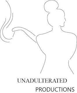
  The reason for the design is I originally thought of the name "Contour" after hearing it in the class lecture on logos. I thought of the drawing on the cover of the Average White Band album, and would follow along its ascetic. The logo at the top is the result. The name "Contour Productions" was taken by some wedding filming service, and after four more potential names, I came up with "Unadulterated Productions." Unadulterated means not abridged, and pure, and I would like that to be characteristics of films this production company will film, and be shown as: unabridged. 

Peace

Image
 The peace graphic was not my first choice in choosing a symbol to recreation. The first was the Skynet logo from the Terminator movies, but it involved tedious lines from within the triangle. Second was the Diver Down flag, I thought of it because it is very simple, but I wanted to choose something with a better reason than simplicity. I choose the peace symbol because it is a powerful symbol, easily understood and recognized, and with history.  Reference Image My Version //the circle ctx.beginPath(); ctx.arc(400, 300, 200, 0, 2*Math.PI, false); ctx.lineWidth=30; ctx.stroke(); //the line ctx.beginPath(); ctx.moveTo(400, 100); ctx.lineTo(400, 500); ctx.lineWidth= 30; ctx.stroke(); //Line L ctx.beginPath(); ctx.moveTo(200, 378); ctx.lineTo(400, 300); ctx.lineWidth= 30; ctx.stroke(); //Line R ctx.beginPath(); ctx.moveTo(600, 378); ctx.lineTo(400, 300); ctx.lineWidth= 30; ctx.stroke();